What is Brand Identity? and How to Create and Design a Fantastic One?
Your brand identity is the secret sauce of your company that sets you apart from any other company on the block, much as your personal identity makes you uniquely you.
So what is brand identity, exactly? What link does it have to design? And how can you build a good brand identity that drives the company forward?
What is Brand Identity?
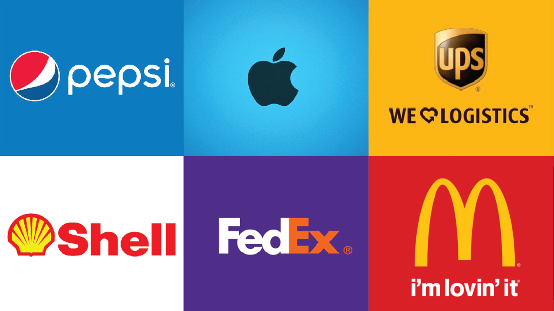
The collection of all items that a company creates to present the right picture to its consumers is known as brand identity. And as these words are often used interchangeably, brand identity is distinct from “brand image” and “branding.”
The marketing method of deliberately forming a recognizable identity is referred to as branding. The company’s name is how the rest of the world sees it.
Your brand identity is what makes your customers recognize you right away. Your audience will associate your brand identity with your product or service, and that identity is what creates a bond between you and your customers, builds customer loyalty, and shapes how they perceive your brand.
How to Create a Strong Brand Identity?
Know Who You Are
Before you can figure out what tangible elements will make up your brand identity, you must first figure out who you are as a company.
A few main elements make up who you are as a brand:
- Your Mission: What is the explanation behind your “why?”
- Values: What are the ideals that guide your business?
- Brand personality: What kind of personality would your brand have if it were a person?
- Unique positioning: How do you set yourself apart from the competition?
- Your brand voice: How would your brand communicate if it were a person?
These are the elements that define your brand, and it’s critical that you understand them all before you start building your brand identity.

Don’t stress if you’re having trouble figuring out who you are. A simple brainstorm can sometimes be all you need to get clarity on who you are as a brand.
Ask yourself:
- Why did we start this company in the first place?
- The ideals and principles that we truly believe as a company?
- What are we good at that no one else does?
- What makes us unique?
- Three words would you use to characterize our company’s brand?
- What three words would we want our clients to use to identify us?
It’s time to create the identity that will carry the brand to life and show who you are to the people that matter most: your clients, after you’ve determined who you are as a brand.
Design: The Base of Your Brand Identity

Your concept would create the brand identity of your company, much like your Adidas created the brand identity of your middle-school-star-athlete persona.
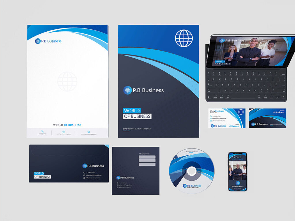
The tangible elements that will determine how your brand is perceived are your corporate design assets. Your logo, packaging, web design, social media graphics, business cards, and the uniforms your employees wear are all examples.
To put it another way, nailing your design equals nailing your brand identity, which equals building a successful business that accurately reflects who you are as a brand.
So, how do you nail your design and create a brand identity that will propel your company forward?
Creating a Brand Identity
Before you begin creating your design assets, you must first establish the foundation of your design structure: the elements that make up your brand identity.
Before you start creating your design assets, you’ll need to figure out the following building blocks:
Typography
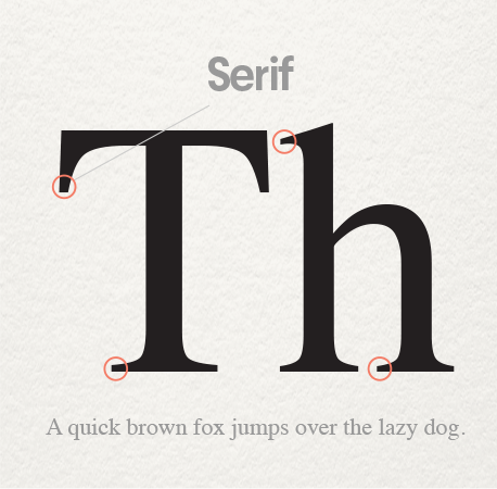
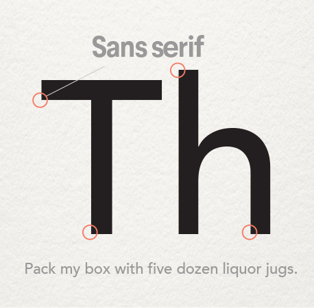
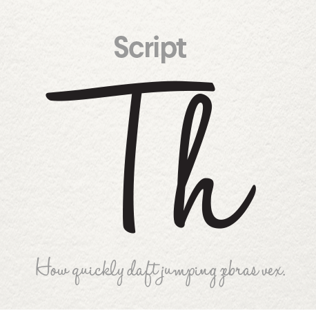
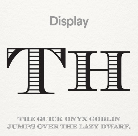
The font you choose for your branding materials is referred to as typography. It’s especially crucial to pick the right logo and brand fonts. Typography is divided into four categories:
- Serif fonts each letter should have what seems to be an anchor (or little feet) at the end. If you want your brand to look trustworthy, conservative, and a little old school, use this classic typography.
- Sans serif fonts are letters that miss the anchor or “feet” of their serif counterparts and have flat edges. Sans serif fonts offer labels a more elegant, contemporary look.
- Script typography mimics the style of cursive handwriting. These fonts will help you give your brand a more luxurious or feminine feel.
- Display fonts are in a class by themselves. Each show font has a unique attribute, such as a unique letter form, outlines, shadowing, or a more artistic/hand-drawn border. Want to make a bold declaration and create a brand name that people can remember? It’s a smart way to do it with a window font.
Choose your fonts carefully and the typography you use will tell a lot about your brand.
Color Palette
Then there’s color. Different colors have psychological meanings with individuals, including your future clients, and creatively utilizing branding colors and logo colors will have a huge effect on how your brand is viewed by your target audience.
Here’s what the rainbow’s shades (plus a few extras) can do with the brand’s identity:
- Red: The color red is synonymous with enthusiasm and excitement. If your brand name is loud, young, and thrilling, this is the ideal choice.
- Orange: Orange is a high-energy hue that is perfect for looking welcoming and playful. Since it’s less common than red, it’ll make you stand out.
- Yellow: The colour yellow, which is synonymous with pleasure, is a cheerful color. It’s a good choice if you want to feel fun, open, and inexpensive because of the cheerful vibe.
- Green: Green is a very flexible color that can be used by virtually any brand. However, when people see green, they equate it with one of two things: money or nature. If either of those items are important to your brand, green is an excellent choice.
- Blue: Blue is the most commonly attractive color in the spectrum, and it will make the branding look more secure and trustworthy, so use it if you want to cater to a wider audience—and win their confidence in the process.
- Purple: Purple is the colour of royalty, so it’s a good bet if you’re looking for a lavish feel in your branding.
- Pink: Pink is culturally synonymous with femininity, so if your brand is directed at women, it should be a good candidate for your brand hue. It’s also a great color for brands who want to project a soft or luxurious image.
- Brown: Brown is probably the least widely used color in branding, but it might work to your benefit! It makes you stand out when you do something new. Brown may also make the brand look more rugged or masculine.
- Black: Nothing is more timeless and powerful than black if you want to be regarded as modern or elegant.
Form and Shape
You should also remember type and shape when designing the projects. This subtle yet powerful feature can be used to reinforce the desired response from the customers: for example, a logo with both circles and fuzzy edges can provoke a somewhat different response than a logo with sharp and square edges.
Here’s how different forms can shape your brand identity:
- Round shapes: The warm and fuzzies are all over shapes like triangles, ovals, and ellipses. Brands with circular shapes will elicit feelings of identity, harmony, and affection. The rounded edges have a feminine feel to them.
- Straight edged shapes: People equate squares, rectangles, and triangles with strength and efficiency. The straight lines express continuity and reliability, but be careful: if the shapes aren’t balanced out with something pleasant, such as bright colors, they may appear impersonal and struggle to communicate with your consumers.
- Straight lines: Vertical lines mean masculinity and power, whereas horizontal lines imply tranquility and mellow vibes.
Designing Your Brand Identity
It’s time to partner with a designer to bring your brand name to life and transform who you are as a brand into concrete design tools you can use in your ads after you’ve worked out the building blocks of your design. Any number of components can be used to convey your brand name. Depending on the structure of your company, one asset may be more critical than another. For eg, a restaurant’s menu and physical room should be carefully considered. A digital marketing firm, on the other hand, should place more attention on its website and social media accounts.
The following are examples of brand identity elements:
Logo
Your logo is the core of the brand’s branding. When consulting with the artist, make sure that your logo crosses all of the boxes:
- Clearly expresses who you are as an organization and what you respect.
- Is visually appealing: ease, cleanliness, and a lack of clutter go a long way.
- Is timeless rather than trendy: the last thing you want is for your logo to become outdated after six months.
- Plays by the laws of the industry—and if you deviate, do so on purpose.
- Allows an impact on the audience that will last.
You should also ensure that your design partner offers the logo in a range of formats (such as a black-and-white edition or different sizes) so that you can have the logo you need—and that it is compatible with your brand identity.
Read more on how to design a logo.
Website
One of the most noticeable facets of your brand name is your website. Customers will certainly check out your website before agreeing to do business with you, particularly if you operate an online business or sell a digital product. Your website is the place where your brand name can shine brilliantly.
Product Packaging
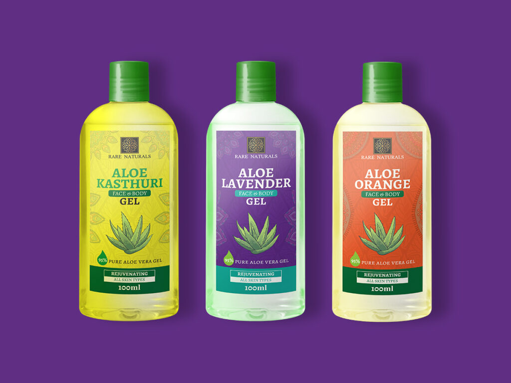
If you’re selling a tangible commodity, product packaging is essential for attracting the right buyers. Don’t underestimate the importance of good design in optimizing the experience – and driving both loyalty and repeat sales – whether you’re thinking about the bottle of a cold-brew beer or the mail you’ll deliver to consumers who ordered clothes from your ecommerce company. Packaging is a great way for the design to stand out.
Business Cards
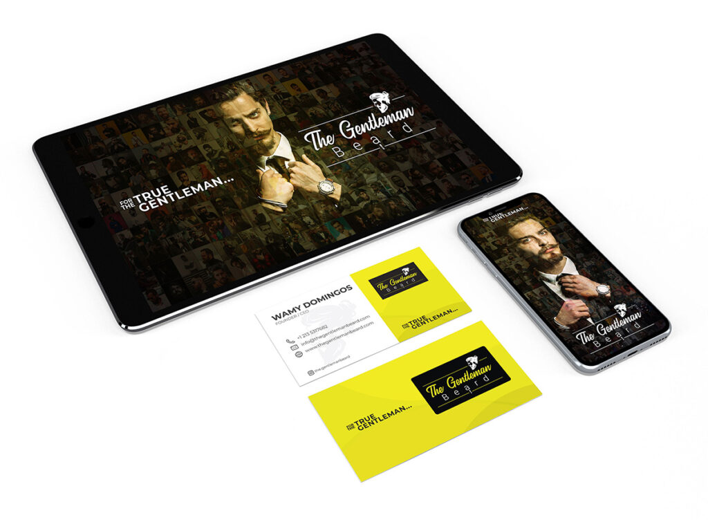
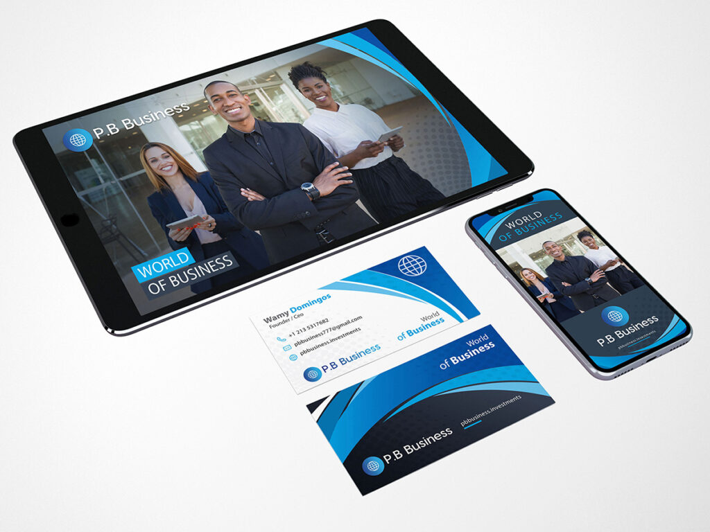
You’ll want to stock up on business cards if you’re doing some form of business growth. A well-designed card allows you the ability to strengthen your good reputation in the minds of prospective clients or consumers. Keep things easy when it comes to business card design: your company logo on one hand and the key personal information on the other should suffice.
Email Design
Email is a fantastic way to stay in touch with consumers and boost revenue. However, since most people’s inboxes are packed, you’ll need the right design strategy to stand out from the crowd if you want to expand your company through email. Remember the email’s target audience. Are you attempting to develop a personal relationship? Then keep it concise, sweet, and clear. Are you attempting to instruct? Then correctly format it to make it readable and scannable, and add a few images to make it stand out. Are you attempting to warn your buyers of a new apparel collection that you’ve introduced? Making a few beautiful product photos the focal point of your website.
Create a Brand Style Guide
You’ll want to make sure the product assets are used properly after you’ve got them, which is why you’ll want to develop a brand style guide. This guide, which details your design tools, where and how to use them, as well as any design do’s and don’ts for your company, helps ensure that any potential design is compatible with your brand name and gives your customer the right idea.
To establish a solid brand identity, you must be consistent. You don’t want your brand to show on social media in a slightly different way than it does on your website. Customers will be puzzled, and the brand would look less trustworthy and competent as a result. As a consequence, make sure you always follow a marketing guide that addresses all facets of your brand identity. That is what will help you to grow brand awareness and loyalty in the long run.
Brand Identity in a Nutshell…
Your brand name is what separates you from the infinite sea of rivals, showing who you are and what they should expect from collaborating with you. It’s also important to nail your brand name and build designs that correctly reflect who you are to your clients if you want your brand to be viewed positively. It’s time to start designing now that you know how to nail that identity.
Share this post with your friends and express your views in the comments below.
