10 Best Fonts For a Clean & Modern Logo Design
Many designers would agree that choosing the right typography is important when creating a modern-looking brand identity. The fonts you choose for your logo and brand identity express who you are as a business.
Apart from colors and shapes, fonts are perhaps the most powerful tool for expressing the brand’s personality. As a result, modern brands are extremely careful and picky about the fonts they use.
Big brands prefer personalized fonts, but you don’t have to craft your font from scratch if you’re a startup. You may simply buy a well-designed font to make you appear modern and professional.
If you’re creating a modern logo for your company, the font you use can make a huge difference. Take a look at the top ten fonts for modern logo design.
- Helvetica® Now
- Proxima Nova
- TT Norms Pro
- FF DIN®
- Avenir® Next
- Nexa™
- Cera Pro™
- Mont™
- Intro™
- Gilroy™
1. Helvetica® Now
Helvetica Now is a redesigned version of the classic Swiss typeface Helvetica. The redesign has made the fonts every glyph transparent, simple, and neutral.
Helvetica Now is available in 48 weights, with corresponding italics, ranging from Light Micro to Extra Black Display.
Max Miedinger, Charles Nix, Monotype Studio, Jan Hendrik Weber, and Monotype designed and published Helvetica Now.


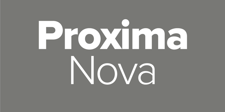
2. Proxima Nova
Published in 2005 Proxima Nova is a complete rework of the popular Proxima Sans with 144 styles.
Blended with modern dimensions Proxima Nova takes a geometric appearance.
This is a widely used typeface that is frequently defined as a cross between Futura and Akzidenz Grotesk.
The font family grew from 6 to 48 full-featured OpenType fonts in just a few years. Proxima Nova is a combination of humanistic proportions and a geometric appearance.
Mark Simonson designed and published Proxima Nova.

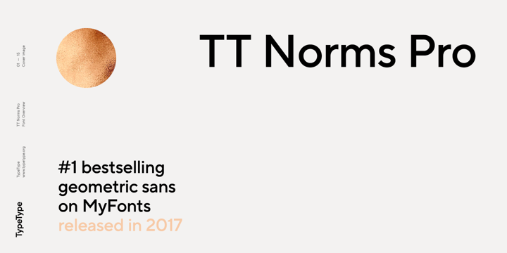
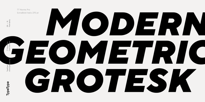
3. TT Norms Pro
TT Norms Pro, also known as one of the most popular sans serifs ever designed.
The geometric sans serif TT Norms Pro has classic style character proportions.
TT Norms is “the one,” the indispensable universal font for logo design, which fits equally well in massive text arrays or headlines.
The font family consists of 18 reworked fonts with a total of 1392 glyphs, 24 OpenType features, and support for over 216 languages.
Ivan Gladkikh, Pavel Emelyanov, and TypeType designed and published TT Norms Pro.

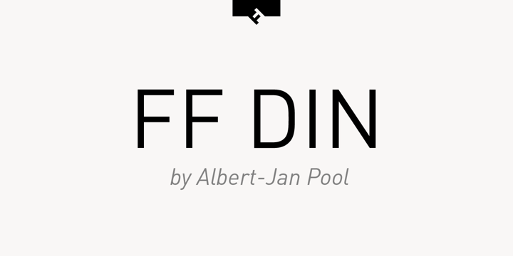
4. FF DIN®
FF DIN was designed between 1995 and 2009, and despite its basic, technical nature, it quickly became a hit and is widely considered as the best condensed technical font ever created.
Packaging, editorial, posters, billboards, way-finding and signage, and, of course, logo and branding are all good uses for the font.
The typeface has found its way into corporate and journal typography, as well as cultural organization posters.
Dutch artist Albert-Jan Pool created FF DIN and FontFont published it.

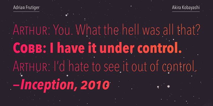
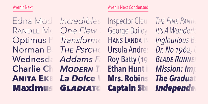
5. Avenir® Next
Avenir Next Pro is a fresh take on a classic face, with revised professional standards that go above and beyond the norm.
Avenir® Next is a linear sans serif in the Erbar and Futura style.
This family includes types ranging from ultra-light to heavy, as well as condensed faces that are as readable on and off-screen as any other sans on the market.
The heavyweights are outstanding show faces in and of themselves, and they work well with a wide range of contemporary serif body styles.
Avenir is a French word that means “future,” but unlike Futura, it is not purely geometric.
The “o” is not a perfect circle, vertical strokes are thicker than horizontal strokes, and the ascenders are shortened.
These subtleties help legibility and offer Avenir a balanced and sensible appearance in both text and headlines.
Adrian Frutiger and Akira Kobayashi designed Avenir Next and Linotype published it.
Akira applied his finesse and ideas to Frutiger’s original goal of creating a typeface that was not only modern, but also ahead of its time.


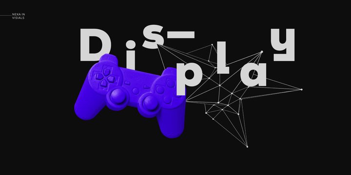
6. Nexa™
Nexa is one of the most well-known typefaces of the modern era. Famous geometric sans serif with a wide range of styles.
For motion graphics, web, print, and well-finished geometric logos, this font was created with excellent legibility and readability in mind.
There are 9 weights and 36 fonts in the Nexa font family.
Overall, the design of the family is simple and elegant, and it fits well for both logos and headlines.
Svetoslav Simov, Plamen Motev, Mirela Belova, Stan Partalev, Nikolay Petroussenko, and Ventsislav Dzhokov designed Nexa and Fontfabric published it.


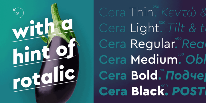
7. Cera Pro™
Cera Pro comes with 12 different types as well as a family kit option. Pure geometry drives this pan-European font.
The font is made up of basic shapes and exudes ease, elegance, and a sense of modernity.
Cera Pro is available in six weights ranging from slim to black, offering you a wide variety of options for interfaces and organizational design in print, on screen, and through several languages.
When used for show typography, carefully sloped 10º italics create a striking effect.
It also includes all of the required dingbats and arrows.
Jakob Runge designed Cera Pro, which was released by TypeMates.


8. Mont™
Mont is available in 10 weights ranging from Hairline to Black, as well as matching italics.
Mont is a well-balanced yet characteristic font with unique details.
The pointed “t” and prominent x-height are two of these details, which make it ideal for powerful headlines and outstanding logos.
In total, the font supports over 130 languages.
Tabular figures, advanced typographic features such as ligatures, fractions, case-sensitive types, superscripts, subscripts, and so on are all included in the Mont fon family.
The typeface’s flexibility allows it to tackle any graphic design challenge, whether it’s for the web, print, or motion graphics.
Svetoslav Simov and Mirela Belova designed Mont, which was published by Fontfabric.


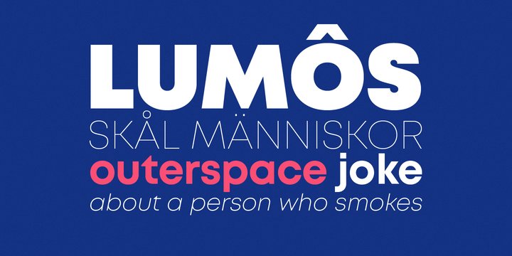

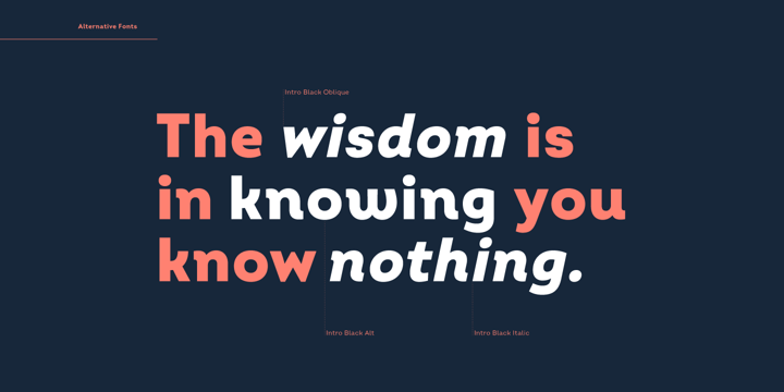
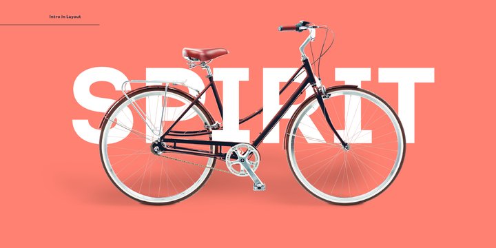
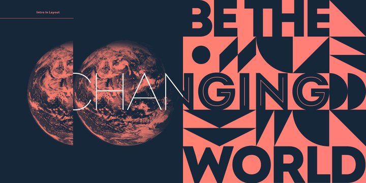
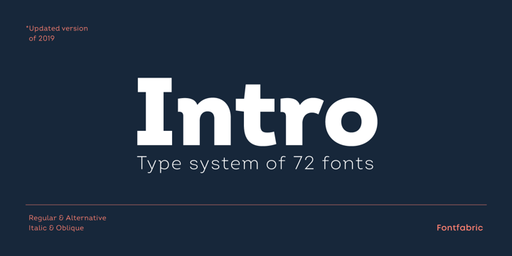
9. Intro™
Intro is a versatile sans serif font with a few unique features such as serifs.
With a touch of elegant playfulness, this is a modern look.
Because of its unique characteristics, many modern graphic design agencies use it in their work.
This large family includes 72 font types in eight weights, as well as italics and a simplified edition.
The flow of this font is ideal for creating simple and minimalist wordmarks.
Svetoslav Simov and Stan Partalev designed the Intro font, which was released by Fontfabric.
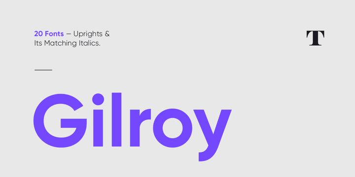
10. Gilroy™
Gilroy is a modern font that is currently very common in logo and wedding design. Gilroy is a geometric sans serif with a classic feel.
The font is built on geometric shapes, near-perfect circles and squares, and is the younger brother of the original Qanelas font family.
The font was created with the use of powerful opentype features in mind, making it ideal for modern graphic design.
It is suitable for branding, blogs and publishing style.
Since the light and extra bold weights are free, you can use them as much as you want.
Radomir Tinkov designed and published Gilroy.
Some people will like these fonts, while others will not.
When it comes to minimalism, though, it’s a very basic, very plain look.
However, by selecting the appropriate typeface, you can make it special and distinctive.
Check out some of the fonts used by well-known brands.
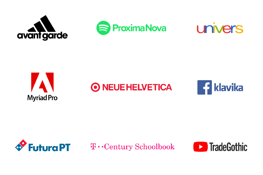
Do you see any resemblances? The majority of them have modern typography that is simple but well-designed.
Are you looking for a logo designer?— Simply contact us.
Share this post with your friends and express your views in the comments below.