Logo Design Trends for the Year 2021
The big trend in logo design that we have seen over the last few years is minimalism – the absence of unnecessary elements from the composition. This seems to be consistent with trends in graphic, web, and UI design – a shift to clean, flat, and minimal aesthetics. Also, today, logos need to be legible and consistent across a variety of devices and mediums.
Expect to see further use in logo design this year of gradients, monograms, negative space, geometric shapes, and overlapping elements. Below displays all the latest patterns, with some examples.
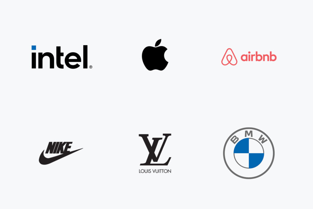
1. Minimalism Logo Design
Minimalism spreads like a wildfire and shows no signs of slowing down. Companies are gradually gravitating towards clean, unbridled designs. In other words, you can’t go wrong by making a simple piece of art!
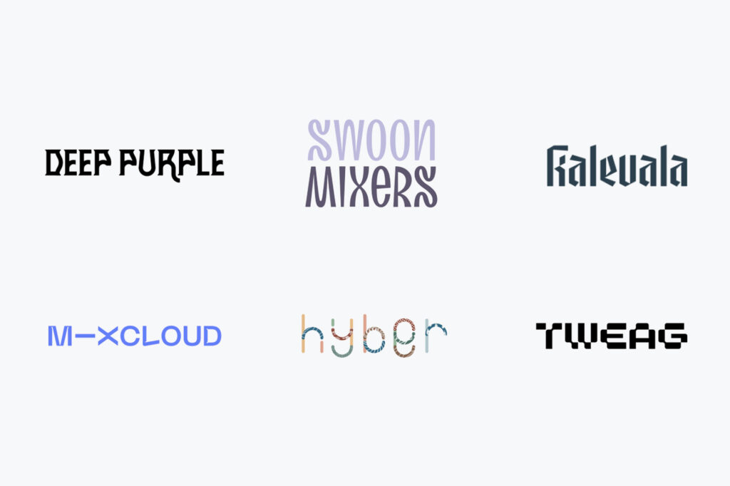
2. Unusual Fonts Logo Design
Intricate serifs, hand-written typefaces, fancy doodles. There are plenty of ways to make an original, eye-catching logo! The tricky part here is to find a special and readable solution.
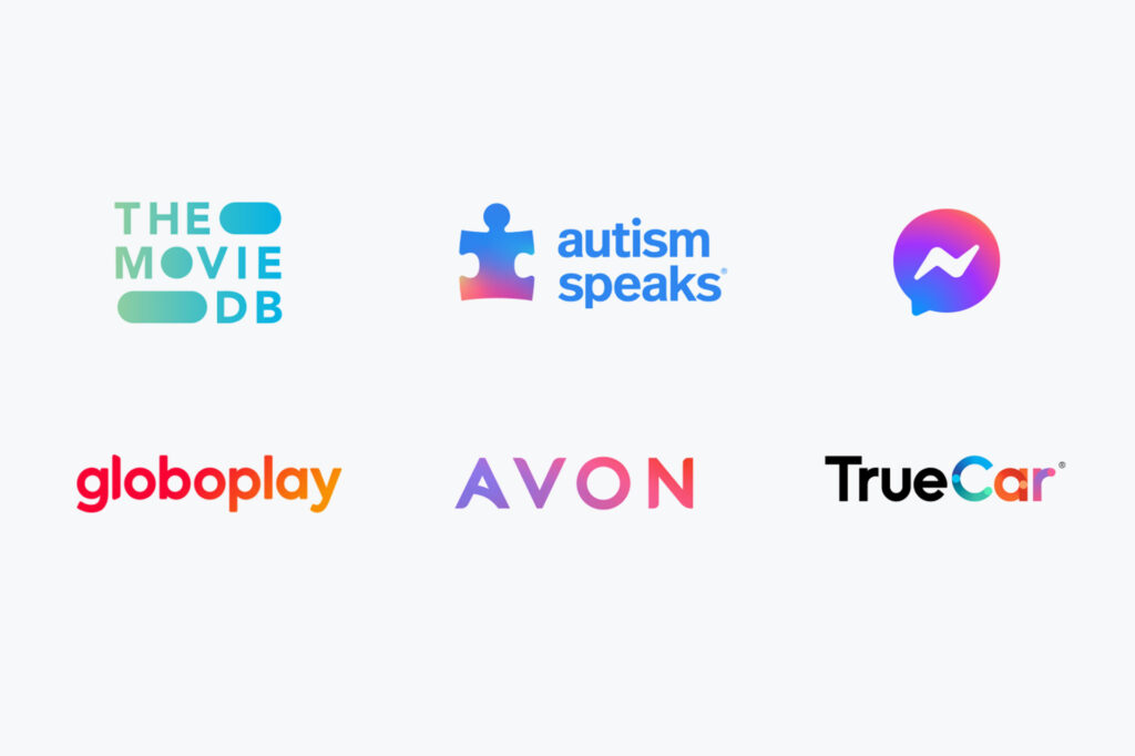
3. Gradients Logo Design
Gradients are a sure-fire way to spic even the most hopeless emblem. Neon shades are also in vogue, so make sure to try them. Also, maybe it’s a good idea to play around with saturated primary colours.
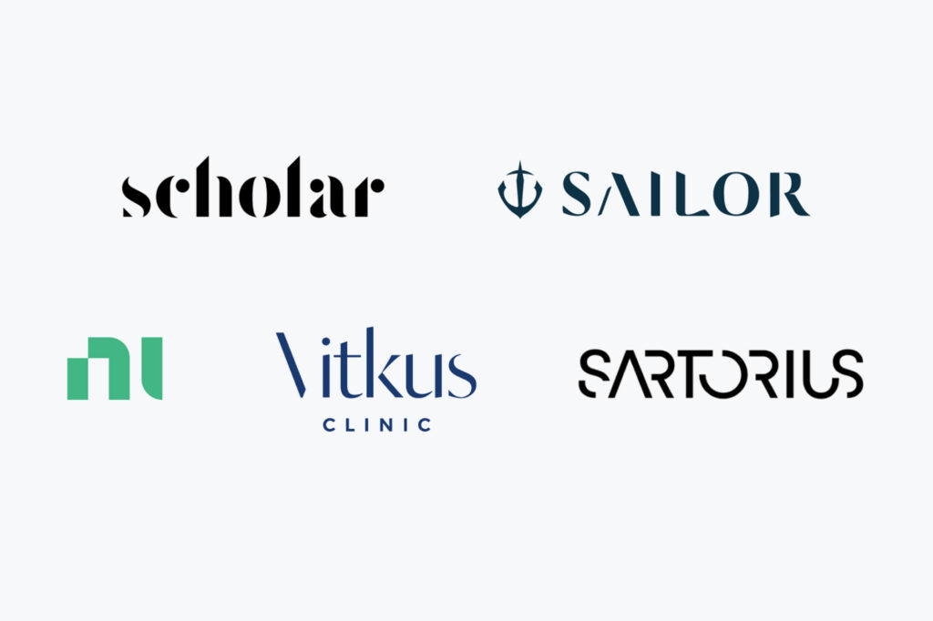
4. Text Destruction
Removing a part of a word or an image is a common technique to make a logo stand out from the crowd. Play with fonts and density. At the same time, it’s important to make sure your logo message remains easy to understand.
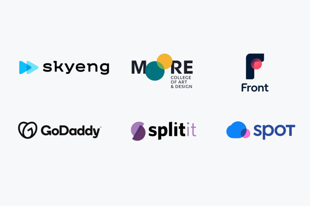
5. Overlapping Elements
By putting various elements on top of each other, you can express a wide variety of strong associations, from continuity and reliability to dynamic growth and development.
6. Blank Space
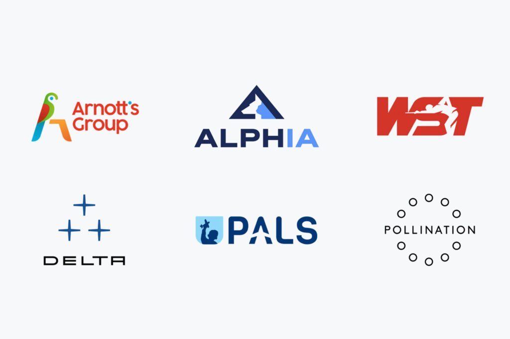
This pattern is projected to grow stronger than ever before. Using negative space is a smart way to add dimension to your logo without cluttering it with more features.
7. Clean Thin Lines Logo Design
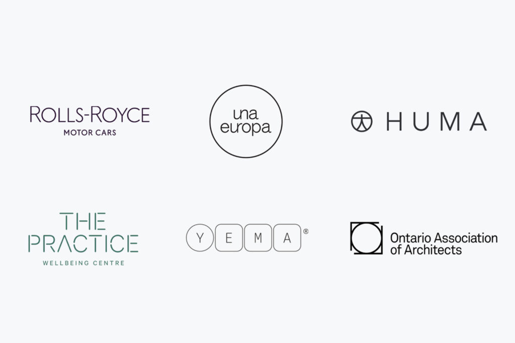
Huge designs are not a cup of tea for all. Instead, try using refined, straight lines. Paired with geometric designs, thin lines make the logo more airy and elegant.
8. Unusual Arrangement Logo Design
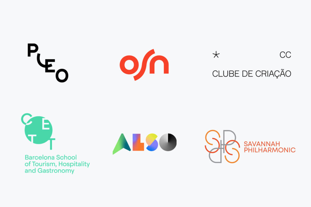
Positioning the logo elements in an unexpected way is a sure way to grab the eye of the audience and stir up their curiosity. It also demonstrates your imagination and you’re out-of-the-box thinking.
9. Visual Balance
A visually balanced symbol is an eye candy for those who dislike logo design asymmetry and deliberate incompetence. If you enjoy consistent and proportionate templates, be sure to tap into this new trend!
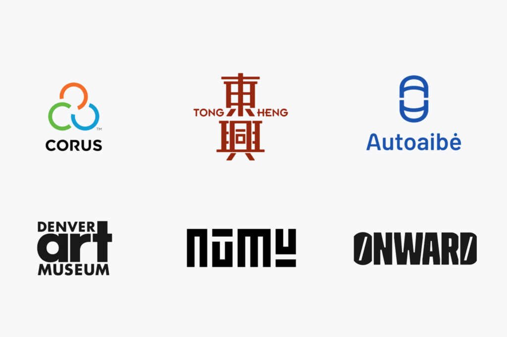
10. Monograms & Abbreviations
Monograms and abbreviations are a staple, never fading, that designers can’t get enough of. Creating a convincing monogram can be tricky, but the final result is worth the effort!
Share this post with your friends and express your views in the comments below.
